I have always had a respect for authority, never really been rebellious. Rules don’t bother me unless they are stupid rules, then I want to push back against the rules. Don’t get me started on politics. You have been warned. When the glamour magazines come out and “let us know the new color of the season.. it’s so magical how they all get the same colors from magazine to magazine, the stores are in line with this too—did they take a survey on the street of thousands of woman? Was it off of what a famous person decided? Color is so powerful that when we think of neon we think of the 80’s or now… (these colors are back in trend – regurgitation of the 80’s.) Yes, I am not a fan of florescent neon unless you are a kid, but in a business meeting.. ack!
So how are the “it” colors decided upon? Who are the they that we all follow from fashion, home décor and makeup? “They” are Pantone. Mystery revealed? No, who are they? A secret society from the dark ages bent on gaining power .. oh sorry different group.. heehhee. Have you ever tried to describe a color over the phone? I have its like describing the taste of salt! No matter how many adjectives you use you know the other person is not seeing what you are! Specific colors are in your mind are associated with memories. Whenever I think of a brown horse I can see the hide color of the horse at Grandpa Chuck’s. Not all brown horses are that exact color but to me—when I say ‘brown horse’ I think of that exact shade. Due to working with a specific product line when you say Currant I immediately see SeneGence Currant Lipcolor in my mind but other companies have named their cosmetics Currant and they are different shades.
If I were painting my house and I need to order more paint, what do I do to get the same shade? Well, in stepped Pantone. In the 1950’s they came up with a color matching system, each color was given a number. This filled the need of graphic designers to say to each other we want 5,000 copies of this Pantone red 345 or whatever color they wanted to match. Brilliant really. Now over the phone the pros could share the exact color they wanted based on Pantone’s color matching system. How Pantone became the color deciding gurus of the fashion world, I don’t know. I bet it’s in a meeting, “Okay, so humm we gotta do this season thing again.. so what have we not used recently?” So every Spring and Fall Pantone tells us what is cool and we change out our couch cushions, go on the prowl and buy that new trendy outfit
.
So here is my problem—every new season I see women, especially girls wearing the “it” color and it looks horrid. Not because she is not lovely and amazing because I believe all women are, but because that color doesn’t look good on her!! So if the colors coming out are good for you this is great, this falls colors just happen to be for those with yellow undertones to your skin. If you are a pinky toned skin not so good, the it colors will be wearing you not you wearing them.
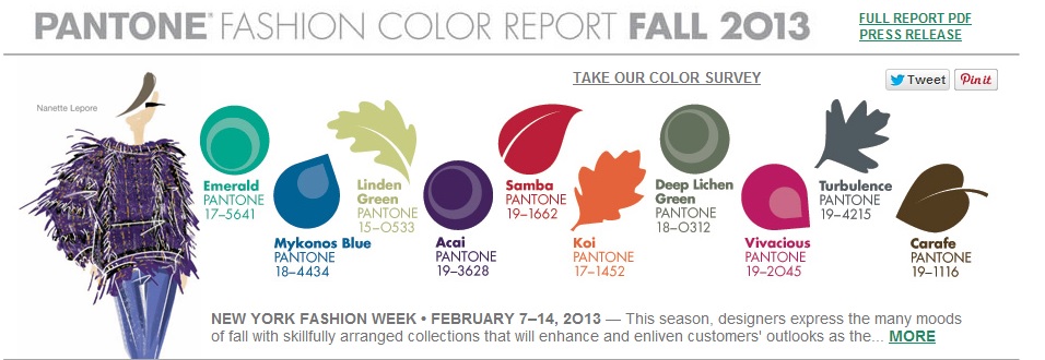
What colors you wear whether they are the “hot” color of the season or not, should look “Hot” on you! I happen to look sensational in the jewel tones of this season, and I’m excited to get more brown shirts because when brown is not hot the selection of brown can be limited. Three years ago I had to have a royal Blue suit.. impossible to find! I had to have one custom made. Now its going to be easy.. the choices will runneth over because Pantone has decided that Mykonos Blue, which is a royal blue enough for me, is in this season! I will be able to find shirts that go with my suit! And my brown pants which the brown tops are starting to fade, I get to brush off the dust we are going shopping. And ohh, the Acai Purple is amazingly great color on me and other women with yellow undertones to their skin.. last seasons colors.. not so much. I walked in to stores and walked out because those colors didn’t look good on me.
So shop to look hot, shop to look fabulous shop for the right colors if they are “in” or not—Do you want to look Trendy or Hot?
More information on the Pantone colors can be found here: http://www.pantone.com/pages/fcr.aspx?pg=21057&ca=4
By the way the spring, summer, fall winter was designed for white women. Forcing all women of color in the “winter category”— that will be another great post soon!


